I’ve not done an update for a while, so if you have a spare few minutes, grab a cup of tea and have a little read about the progress that ‘Legend of Hand’ has made since the start of the year.
Firstly - We were greenlit on Steam! It was a rocky ride and I’ll blog more specifically about my thoughts about how that process went in a future post. In preparation for our campaign, we got out a demo for the game which included the majority of the 1st island. It’s been good to finally see people reacting to the game (via YouTube playthroughs and general feedback). The graphical design choice seems to have been one of the demo’s main talking points and with this in mind, I’ve made graphics the main focus of this particular entry.
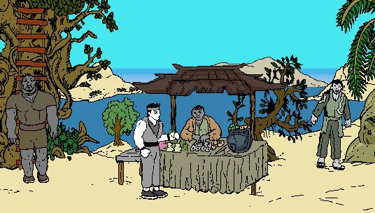
Hand uses AGS’s favoured 640 x 400 resolution with black outlines on top of mostly flat colours. Using this graphical style was one of the earliest decisions I made for the game. Well, in truth the game started out as a quick test for a scrolling background (and here we are over two years later…). The block colours with black outlines are certainly not going to be to everyone’s taste but I feel there is a certain charm to them once animated that will land LOH a small place in the hearts of those who delve fully into the world. Most importantly, it was a style that I knew would be just about sustainable for the ambitious scale of this project, considering the tiny team we have. My thinking was that by keeping the colouring as simplistic as possible, I would be able to churn out a huge amount of animations. Whether that gamble will pay off will only reveal itself in the final product I guess. Will people be turned away by the quirk of this style or will they warm to it and what it offers?
As time has gone on, amendments to the style have been made and changes integrated. I definitely made quite a few errors in the beginning. I initially scanned in artwork and scaled it down and then spent ages cleaning it up. All of that is now pretty much streamlined - we are now at a place where we quickly draw direct onto the computer or ink out drawings on paper and scan in at the useable size. Having these two interchangeable methods has kept me fresh and stopped boredom getting the better of me. It’s also allowed my eyes to handle the task better as my eyes suffer greatly from staring too long at a computer. Thinking back, I can see that I really should have taken a bit more time to flesh out this design process right at the beginning - but you live and learn.
Once my initial excitement had passed (after about 30 seconds) of seeing a character move around in the landscape for the first time (before this project, I’d only worked with photos for ‘Mudlarks’) it started to become clear that the flat colour palette made the game seem very still and soulless. Just having the odd bit of movement here and there such as characters blinking was not enough. So after the first part of the game was constructed I gave characters huge makeovers in terms of idle animations. Still motionless sprites have now been replaced by the moping of brows, yawns, head scratches and even nosey turns as you walk past them, which I feel has certainly brought things up a notch. The playable character has many different idle animations and I really want the player to enjoy the world and take moments just to sip away at a cup of tea while watching characters go about their business. This is where the art style is showing its benefits- these changes and additions can be made fairly quickly and the only real limit is where we want to draw the line with it, as we have so many characters and animals. That and of course, the limitation on sprites that AGS allows- it’s huge, but we actually might begin to reach the upper thresholds (30,000) the way we are going and we don’t want the game to start to chug.
Various characters will watch you with interest as you walk past, while stall owners will try to wave and yell out to tempt you over to purchase goods
At the time of writing we are working on the games 3rd island. This beachy tropical island is where the amount of fights on offer really jumps up and the RPG elements and levelling up start to come into their own. Animating sets of fight moves for characters is one of the most time consuming aspects of the project and I’ve had to try to streamline this process as much as possible. After months of Shaun’s constant nagging, I’ve finally started using Aseprite and I kick myself for waiting so long (yes Shaun, I should have listened…) before using this little gem to generate, test and flesh out animations for characters. It means I can refine animations and send them directly to Shaun for quick implementation whereas before I was giving him large sprite sheets created using paint software, not knowing how the actual animations would even look! All of the graphics of island one were done in this way and the difference in quality between these early animations and newer ones is clear. We will probably have to revisit the games early animations at some point.
I hope I can keep churning out numerous little animations for this project without running out of steam. Even with this method it’s been a real grind and my mind constantly wonders to new ideas and the desire to work on anything but this. But then I look at some of the great indie games out there and effort that’s gone into them- and realise I need to get my head down and keep going. Luckily Shaun is always on hand to crack the whip!
I hope I can keep churning out numerous little animations for this project without running out of steam. Even with this method it’s been a real grind and my mind constantly wonders to new ideas and the desire to work on anything but this. But then I look at some of the great indie games out there and effort that’s gone into them- and realise I need to get my head down and keep going. Luckily Shaun is always on hand to crack the whip!


 RSS Feed
